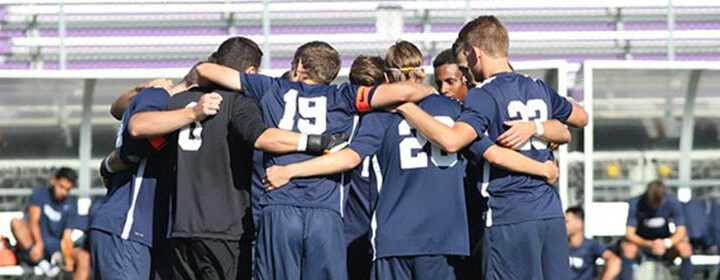
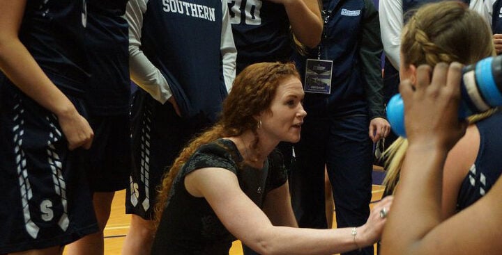
Palmer Piana – Photo Editor
Southern’s logo got a fresh makeover over the last couple weeks. A new design was revealed and can be seen around campus on t-shirts, hoodies, the school website and at the football stadium bleachers and scoreboard. It’s a darker blue owl, with wings spread, talons visible and glaring eyes. This new owl is said to be intended to be more modern and fierce, according to Mike Kobylanski the assistant director of athletics and communications.
A lot of planning went into this change. Kobylanski also stated that the possibility of the change had been brought up back in 2014. Since then, they have been gathering feedback, working with committees both within athletics and academics and talking with Phoenix Design Works, the design company responsible for making the logo.
Jay Moran, the director of athletics, said, “There was a big push from the alums,” claiming that they “didn’t like it, they liked the old one. They liked the more aggressive owl.”
If a fiercer design is what they were shooting for, they certainly hit their target. Most students seemed to agree that this new logo was more intimidating, for better or for worse.
Dan Perillo, a sophomore athletic training major, stated, “I like it better. it’s more intimidating.”
Abby Bosman, a freshman elementary education major, agreed that it was more intimidating, but added that she preferred the old one because it was “cuter.”
Clare Olivier, a freshman undecided major, said that she preferred the current design because it appears “new.”
Overall, Moran believes the change seems to have bolstered excitement from students, as during the opening ceremony the 1,000 t-shirts supply was gone in about 22 minutes.
“The reaction to it has been very good overall,” he said.
Students excited for the new logo to take the place of its predecessor may be disappointed to find out that the change is still in phase one of its rollout. It will take 3-6 more years before the new logo is universal on campus, according to Moran.
School logos are integrated into a campus in such a way that changing them can be a time consuming and expensive process. The t-shirts in the giveaway cost about $5,000. Moran says this cost was split evenly between the athletic department and public relations. He has hopes of redoing the basketball court with the new logo next summer, as it is time for it be redone anyway, but recognizes that doing it all at once would be a lot of money.
For now, the old owl is not going anywhere very fast. It still remains on the jerseys of the sports teams, hung on banners across campus, on the football field and even in the marble flooring of the field house. But as Moran put it, “There is nothing wrong with keeping a little retro around here.”
Photo Credit: Palmer Piana